Breaking through the noise with a compelling visual identity
In today’s world, there’s SO much happening around us between work, family, friends, politics, and more. Our glasses are already overflowing. Not only is it hard to tell what's important since we’re inundated with information and activity that keeps us distracted, but also our ability to assimilate and learn new things is compromised. With the constant busyness and boxes to check, how can Change Leadership Practitioners break through the noise when stakeholders need to know about a really important change? We sat down with Marcos Goldstein, Founder and Principal Change Maker at FosterWe, to learn innovative ways that his company is helping clients to highlight important change initiatives.
Use emotion to get people’s attention
To really get someone to pay attention, you can’t solely rely on logic—you have to tap into people’s emotions, intrinsic motivators, and behaviors. You must illustrate the emotional need for change to your stakeholders and its connection to the benefits they will individually derive from it. To do this, you have to ask:
What’s the problem the change is addressing?
Who’s the stakeholder, really?
What does the stakeholder care about?
How does this change support the intrinsic needs of stakeholders?
How do you want the change initiative to be seen?
Getting clear about the answers to these questions allows change leaders to sift through the noise and pair logic with emotion and capture the attention of their audiences, briefly, but consistently.
Differentiate through a visual identity
Consider this: stakeholders receive emails from IT, Human Resources, leadership, etc. and oftentimes, these communications are indistinguishable. The communications look and feel the same and people have come to ignore them—and mostly without consequence. In fact, when you look at email readership when it's not something that is directly addressed to you, people aren’t reading it. Because Organizational Change Management Consultants can’t solve for the busyness in people’s lives or the patterns of behavior that have become ingrained in organizational cultures, we have to find a way to shine a light on the change initiatives that are really important. One way to do this is by creating a unique visual identity for the project at hand. A visual identity is the collection of colors, symbols, fonts and other imagery that serve to represent and differentiate something. Doing this for a large initiative will serve as a differentiator, connecting the content to the initiative even before the copy is read. Pair this with compelling, insightful, and actionable content, and you’ll have a brand worth paying attention to.
Distinguish the change from the noise
Create something special to differentiate the project from all other things in the organization
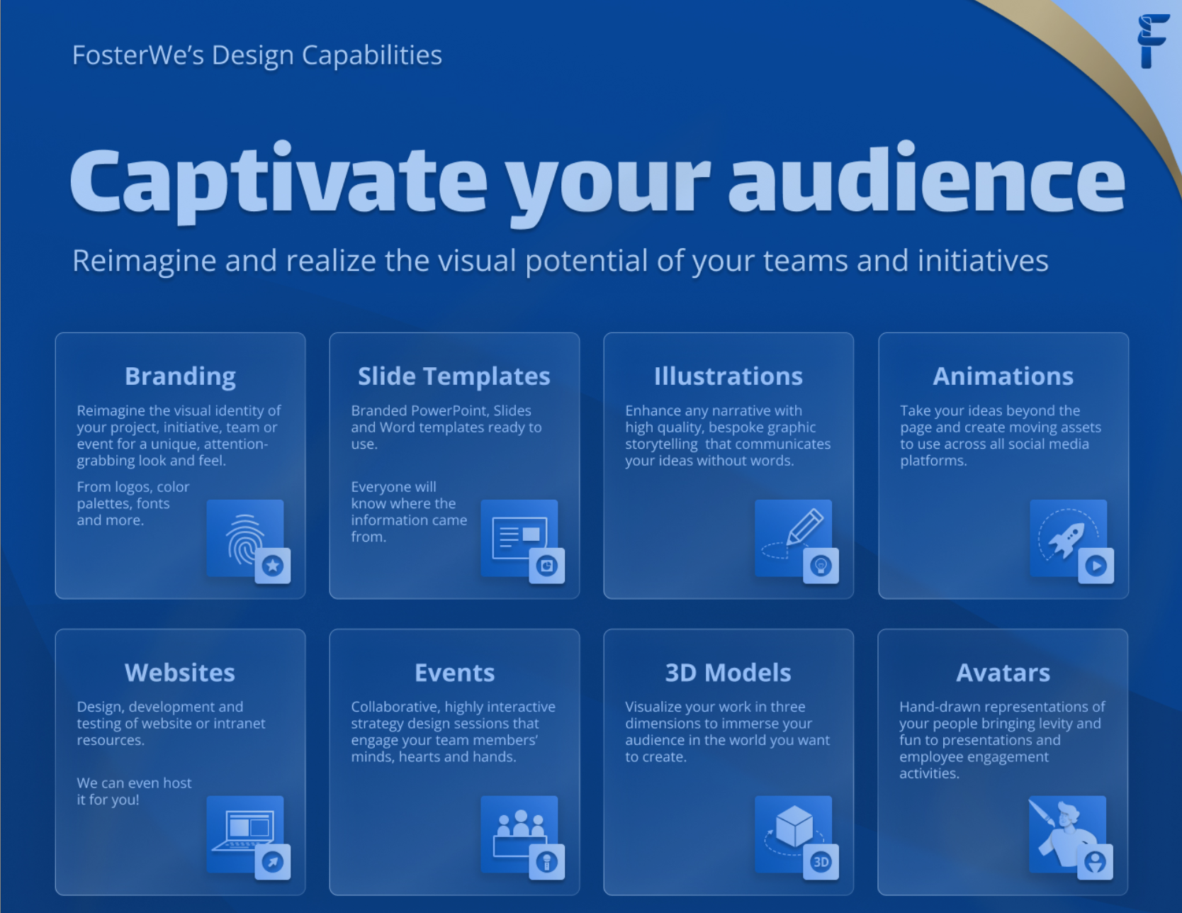
Build a unique graphic language for your initiative inclusive of logo, color palette, fonts, presentation templates and graphic elements such as personas, icons, and infographics—in support of your goals
When people get something new and different, they’re more likely to open it!
Include the individual value proposition
What’s in it for the stakeholder?
What does the stakeholder care about?
Are you speaking their language? Does this even matter to them?
Are you providing opportunities for levity and humor?
Are the channels appropriate for your audience?
As an example, Marcos’ company FosterWe created illustrated Standard Operating Procedures as graphic novels for a quality and compliance department. Doing so, they turned a not-so-fun topic into a visual experience that completely differentiated these departmental SOPs from any other process document in the organization. The investment in thoughtfully designing an experience for the audience paid off with greater readership, compliance with the processes, and enhancing the knowledge assimilation of the content.
It also helps that when people see something well put together and professional-looking (read “expensive”) as they automatically assume it is important and worthy of their attention.
Only a visual entry point
While a visual identity is important, it’s not a silver bullet. The visual identity does however give the Change Practitioner an entry point to have a different type of conversation with stakeholders. It helps remove some of the initial roadblocks to make people pay attention. The visual identity provides an infrastructure so that the change content, communications, and related materials visually represent how you want your stakeholders to experience the change.
In a world where distractions and busyness dominate our days, it can be difficult to highlight the really important changes for people. OCMers can get to the heart of stakeholders and capture their attention by pairing logic with emotion. Don’t underestimate the power of a visual experience when designing your change and communication strategies.
Contact ChangeStaffing for support with breaking through the noise and capturing the attention of your stakeholders!
A very special thank you to Marcos Goldstein for his thought leadership and for collaborating with us on this blog.
Written by Kylette Harrison

